I'm not saying I wasn't guilty of it myself. But now, with a few year's hindsight - let me point out some of the worst offenders, and some of the most common rookie mistakes in dorm poster selection. And here's the disclaimer up front. Not all of these posters are bad (though some are). Some are genius. But it doesn't matter. If HBO showed Lawrence of Arabia every night at 8, eventually you'd want it taken out of the rotation. Some of these posters have been in rotation for 30 years.
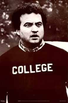
Now, that's possibly the greatest college dorm poster of all time. You get no argument from me. But what you also get from me is a lowered opinion of your taste when I see it on your wall. It's just too tired. It's played. This poster needs to be put to pasture, retired like Babe Ruth's jersey.
.
.
.
.
.
.
.
.
.
.
.
.
.
.
.
.
.
.
.
.
.
.
.
.
.
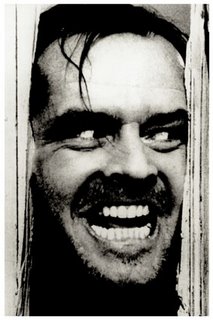
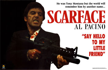
Here you've got Scarface and The Shining. Nicholson and Pacino. You could have also thrown in the Pulp Fiction one with Travolta's and Sam Jackson's guns drawn, or the De Niro Taxi Driver one where he's holding two guns and looks insane. I think our nation's young men have long gravitated towards these as sort of a collective way of asserting manhood. Either that, or it's some kind of boast about character by way of movie-appreciation. "The owner of this poster is into The Shining" says the poster, "Pretty sophisticated, wouldn't you say? Perhaps you'd like to have sex with him?"
Again, not saying the posters suck. They're just tired and overused. Send them to the poster hall of fame and let's be done with them.

.
.
.
.
.
.
.
.
.
.
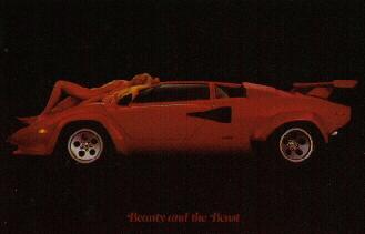
Next up are all those posters that had sports cars AND girls in bikinis. These were so popular and I just never understood the idea. With the Shining-style movie posters there was that double message: 1) I'm badass, and 2) I'm sophicated, please sleep with me. With the cars/babes posters, I guess you kind of have number 1, but you can't even pretend to have number 2. I'm left with only one conclusion: that for these dudes, cars and sex are kind of all rolled up into one icky, low-watt desire. I remember in Europe, the few times I visited, the Europeans love to advertise grocery items using naked models. Like a naked woman pouring orange juice, or eating ice cream. And there's something just a little nausea inducing about that. Two pleasures, great individually, but that just don't go together.
Forget the SAT as a predictor of academic performance. Look at students who have posters of exotic, import cars with bikini clad women. There's your predictor of future success.
.
.
.
.
.
.
.
.
.
.
.
.
.
.
.
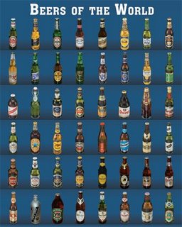
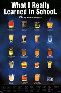
Again, the alchohol themed posters have that same, sad commentary. "I am a man. No really, I am. You see, I drink beer! Many different beers! And shots! A guy trying to fake it might only drink one or two. Not me! Lots and lots of alchohol!" These posters need to be retired immediately.
.
.
.
.
.
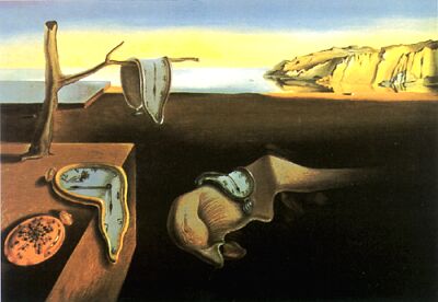
The highbrow, artsy poster guy at least gets points for effort - but why is it always Salvador Dali? Do you think Dali would be depressed if he knew how easily accessible his art apparantly is to 19 year old boys with no imagination? That's gotta be a punch in the gut. Imagine devoting your whole life to serious artistic expression, and in the end you get a massive teen following.
So what posters do I actually endorse? Well that's tricky. A good dorm poster needs to express something unique about yourself. I can't make anyone a recommendation. It's gotta come from within. So what would I choose if I was magically transported back to college? I think I have just the one.

Cause what the hell. I wasn't getting any anyway.
1 comment:
Oh yeah, I've been waiting years for this day... a giant multinational corporation has the same name as my blog... let the bidding begin!!!
Do I hear $1 million US? Yes? 1.5 million? I could also be compensated with stock... a gulfstream jet... Well we can work out those details.
No, seriously, I can't be bought. (yes I can, please offer something) "Zapr" is short for "Zap Rowsdower", the colorful main character from The Final Sacrifice, featured in a classic episode of the US TV show "Mystery Science Theater 3000". I wanted to pick a persona for the blog, I thought - why not Zap? We're pretty much the same anyway.
Good luck with the business, and all those extra millions of dollars that are presumably just lying around doing nothing. Shame about that.
Post a Comment